
Ready Meal Packaging
A conceptual design for a HyVee microwaveable meal
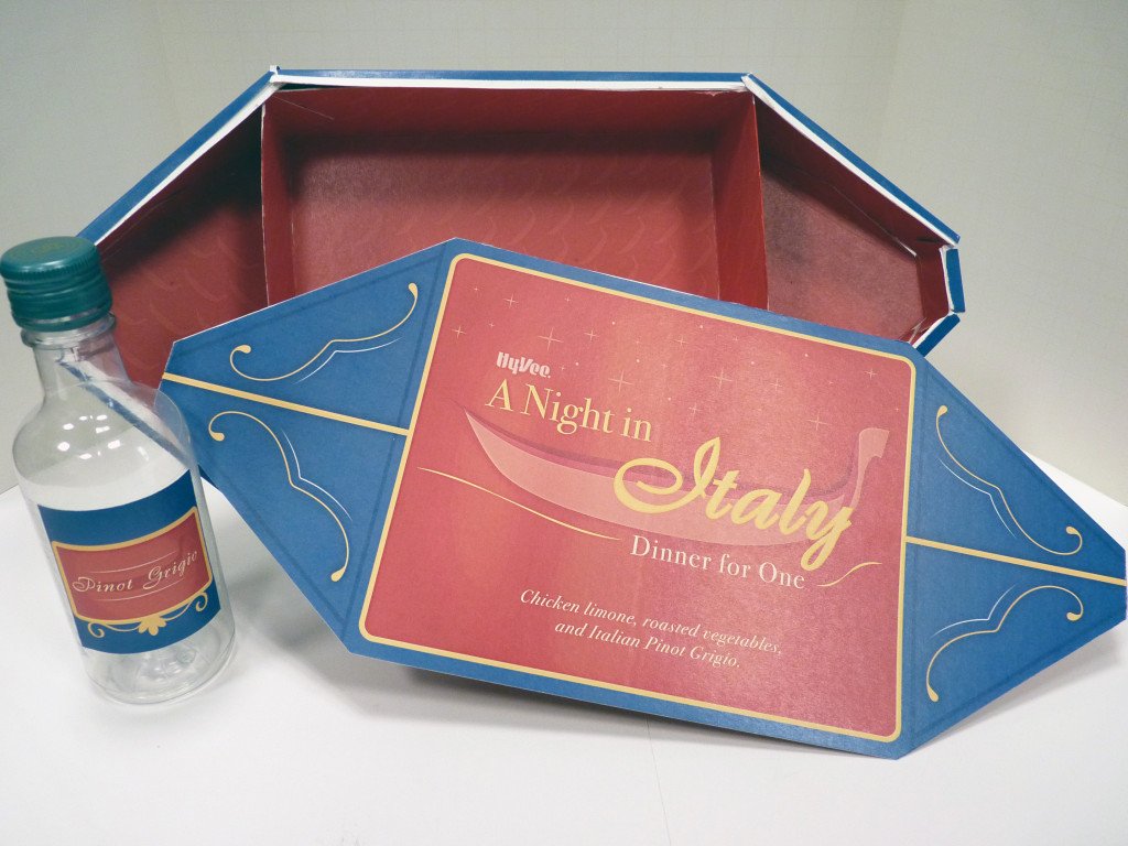
This project was to create packaging for a single-serving gourmet meal that would theoretically be available in HyVee grocery stores. The packaging had to accommodate a meal of at least three items and be able to stack nicely for display in a store. I came up with a romantic Italian dinner theme, featuring chicken limone, Italian style roasted vegetables, and a small bottle of Italian Pinot Grigio. The packaging can be used for other similar dinners as well, with a main item, side item, and wine bottle.
See the finished project below, and keep scrolling to see an overview of the process.
Concept Sketching
This project had to begin with designing the physical packaging. The graphic design on the outside of the packaging could only be appealing if it fit the context of the object it was printed on. I looked at meal packaging in grocery stores near me, as well as examples of innovative and visually amazing packaging from design bloggers and journalists. There had to be some balance between function and aesthetic.
I started with a rather obvious option- rectangular boxes that could be stacked and customized to fit the meal with different inserts. A belly band would wrap around them and have pop-out handles to make it easy to carry. Nothing wrong with it, but the graphics on the outside would need to do some heavy lifting to sell the concept of an Italian dinner.


I may have had a cold when I came up with this packaging. It's a box that opens up the way many tissue boxes do, with perforations to make it easy to reach in and pull out the contents. Inside would be rectangular boxes similar to the first concept. The goal was to go somewhere new with the packaging, but ultimately this design wasn't going anywhere, and was using a lot of material.
I went back to my first design and tried to improve on it to make it simpler as well as more effective. I added feet to the bottom of the boxes and indents to the top so that they could stack more securely and not risk sliding out. It was an improvement, but who wants to deal with two separate boxes for a single serving meal? Two boxes also meant more packaging to be thrown out, and the design printed on the boxes would run the risk of seeming repetitive.
As I worked on creating another box layout to make a physical mockup of, I thought about what shapes would fit the theme. First I considered chopping off the corners of the rectangle to make a suitcase. It would fit the travel theme, but it would still be a rectangle that may need two layers to contain the full meal. Then I decided to expand the sides of the rectangle and create a boat.


Refining
I went with the imagery of a gondola to add to the romantic nature of my overall theme- A Night in Italy. My surface graphics were inspired by the designs on real gondolas. I tried many ways of organizing the interior dividers, and ultimately settled on the rectangular divider system from my earlier sketches. The items that had initially been assigned to a second layer could now fit in the smaller sections on the sides of the gondola.
-
![Lid Wrap]()
Lid Wrap
-
![Side Wrap]()
Side Wrap
-
![Inside Pattern]()
Inside Pattern


