
Peoria Taste Zine
A brief introduction to restaurants in Peoria, IL
I chose to create this zine for Bradley University freshmen who hadn’t stepped out of the “Bradley Bubble” to experience more unique food options around Peoria. Bradley’s campus is a food desert, and aside from a few college-quality restaurants along the edges, the area is cut off from quality dining. But Peoria has more to offer than just what’s around campus, and the city is small enough that it’s easy to get to these places if you have access to a car.
See the finished project below, and keep scrolling to see a brief walkthrough of my process book for this project.


Research
As much as I would love to make a full size magazine featuring all my favorite restaurants, for the purpose of this project I needed to narrow my picks down. I surveyed a group of freshmen to find out which kinds of recommendations and what information would be most beneficial.
This guided me in my layout and organization of the zine, and of course which restaurants I would be using.
Sketching
It all begins with an idea. Maybe you want to launch a business. Maybe you want to turn a hobby into something more. Or maybe you have a creative project to share with the world.
I also chose to incorporate a cartoon cat I draw comics with, who was popular among my design friends at Bradley. Their name is T. Cat and I thought their presence as a little guide would bring some charm and friendliness to the zine.


Theme
I focused on making my zine feel similar to a menu, because it’s essentially a menu of restaurants. I looked at different menu aesthetics and the ways they formatted their text and made a few visual samples to bring to a critique session.
The dark menu is the favorite, which is intended to feel like a trendy modern chalkboard menu. For the formatting of the text, the blocked style I had for the more rustic menu was going to work best to fit in the illustrations of T. Cat as he guides the reader along.
First Draft
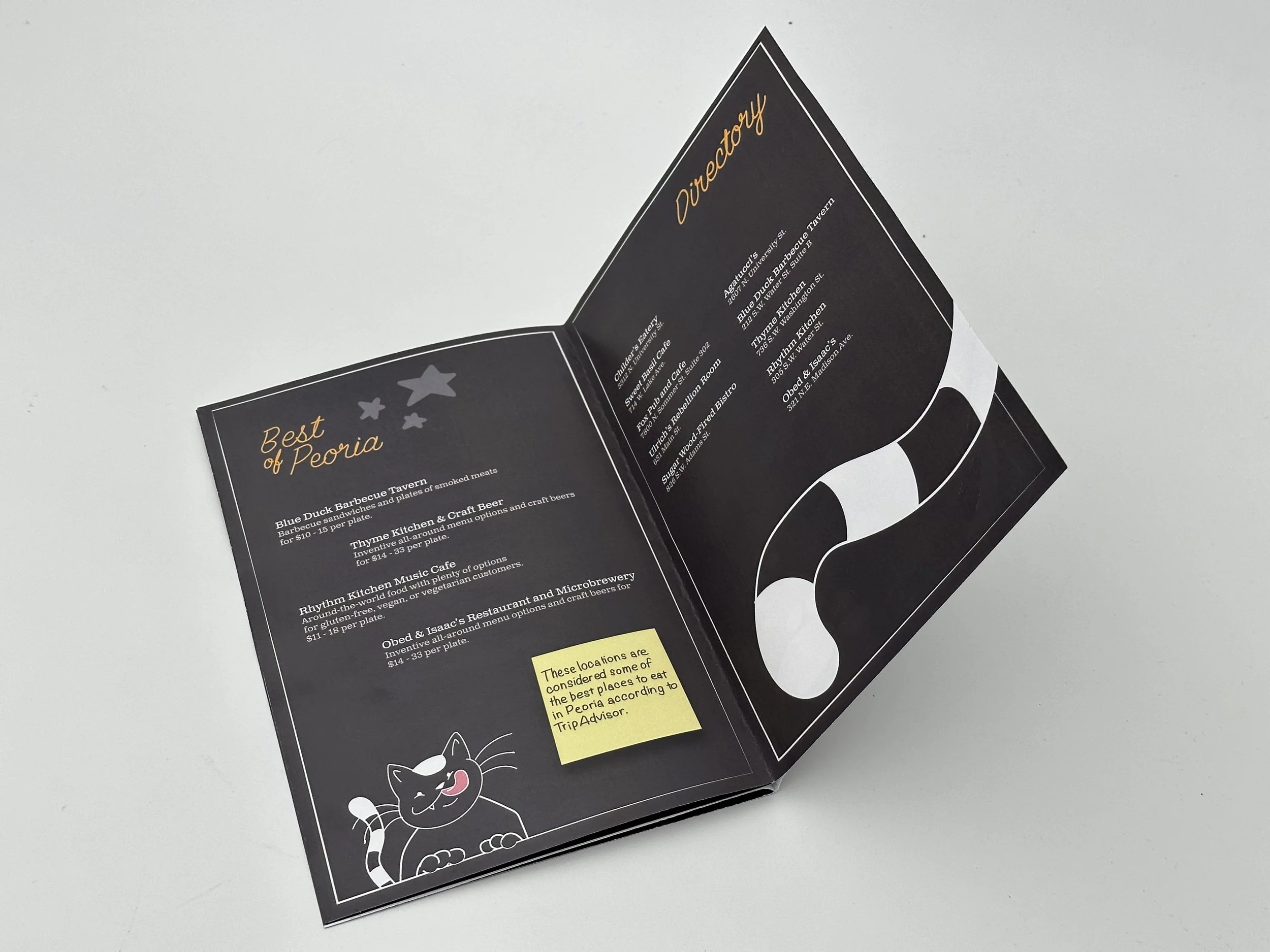
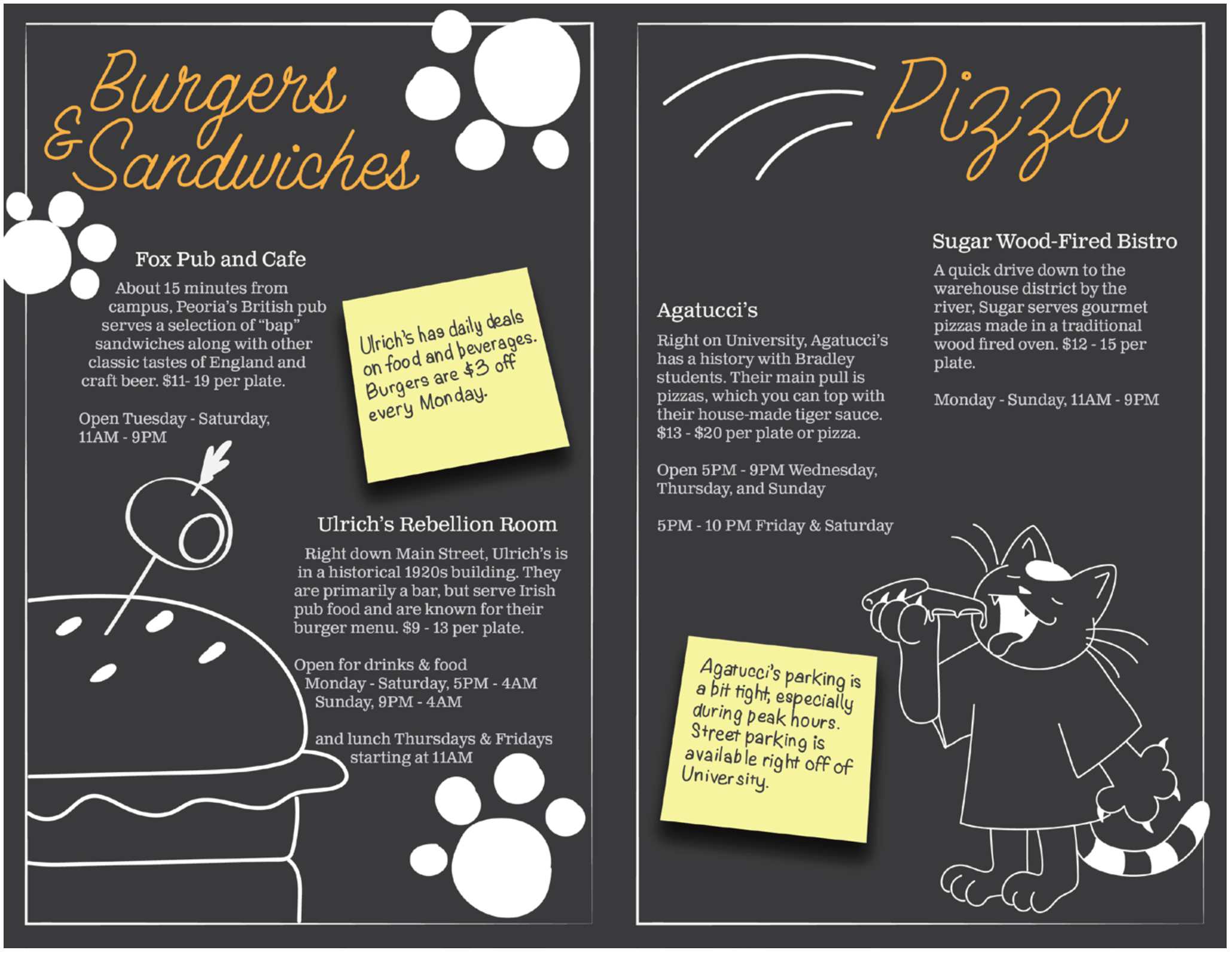
The first real concept of the zine, with a mostly-complete layout of text. The blocks were a spot holder for an idea I had to make more handwritten-looking notes about the page, for example the parking at Agatucci’s is abysmal, and you should expect to find street parking nearby during peak business hours.
Feedback I received on this draft:
Adjust the illustrations to have more movement and consistent sizing
Change the boxes to sticky notes to have a more clear break between the “menu” and the “notes from the cat”
Reduce the number of stars, they’re obnoxious


Second Draft
My second draft, and the first version of the cover page. This time, it has the complete text on each page, providing the necessary information on each restaurant to create a quick but comprehensive guide.
Feedback I received on this draft:
Make the cover more clearly a cat… and flip the sides, they’re backwards
Adjust the formatting of the text to be more consistent and structured
Reduce the size of the titles
Reduce the opacity on accent illustrations, the solid white is distracting from the main drawings


Refining
The third draft, adjustments made. By now, I’m just looking for small final changes to complete the project with.
Feedback I received on this draft:
Add a colored element to each page to bring the viewer’s eyes to the illustrations


Final Draft
The final layout, with all feedback taken into consideration. From here it was printed, trimmed to size, glued, and stapled together to create a complete finished piece.


